Why I left Medium and moved back to my own domain

When I’ve started writing my stories on Medium it felt really good. Medium was the perfect "medium" to share your thoughts with all your followers. However in couple of years it changed a lot and I didn’t liked those changes. What were these?
- Setting up a domain was difficult. You had to sent them an email and wait for it for couple of days. Even with that, you couldn't create domains for your own profile, you had to create a "Publication", which is a profile that can be used by multiple authors. The whole thing was just confusing and I think it was deliberately done to prevent personal users using their own domains. To make it even worse they started to charge a one time fee of $75 (which I think is totally ok, but read more why it doesn't make sense when combined with other issues).
- Content on Medium is great to read. The content just flows. I really feel how they poured hours of thinking into their designs. But Medium also has the power to change it suddenly. It slowly started to adding more and more social media buttons on their website. The design that once clean and simple, started to feel heavy. And because they “have to” grow they started to experiment changing their famous design to increase the engagement (and therefore user growth). One of the end products of this way is that they started using the infamous “dickbars”. I won’t go into details here much as John Gruber already ranted pretty well about it, but I just want to add that I truly hate it.
- Lack of readership communication. Writing comments to Medium posts feels awkward because each comment is treated as a blog post. Even if you just write couple of words, that particular comment will now be seen in your profile page forever. Medium discourages the readers to comment on any of the blog posts. The whole system is created in way that discouraged active sharing of knowledge. Say you decided to write anyway. In this case the frustrating behavior is that nobody can see the response of your comment if I didn't follow you back. You have to make an additional click just to see them. I don't like this at all.
- Private sharing and reviewing never worked well. I’ve had several peer reviews of my posts and every single time the highlighted text would just disappear. I thought it was a great idea to get feedback before publishing it but It never worked well. Still they have great little touches (for example it shows a message that thanks to the reviewers of your post).
- Lack of a front page for your own profile. If you tried to jump to your own profile page, you’ll find out that you have to follow multiple URL's get to your profile page. Just clicking on your avatar doesn’t work. The bad part though is that you don’t have the ability to change your profile page in a meaningful way. Medium decides how to show your own content. And as I said before it'll show your comments made on other blog posts as they were posted as a story itself (which is not!). Again the whole system is designed to make individuals powerless and just to promote constant reading.
I know that Ev tries to establish and create a vision around Medium. However, It seems like I'm not a part of his vision. I know that many others like it and are totally ok with.
I was ok to pay a monthly fee to get a better features that promotes individuals and fixes some of the problems above. But that never happened. And seems like it'll never happen in foreseeable future.
A new home
So here I am. I've moved all my Medium posts to Wordpress.com (and selected the plan to use my own domain). There are several reasons why I've opted for this (which might be coming odd for some of you), but the number one reason was that I didn't wanted to manage anything about my blog. I know things like hugo, jekyll, etc.. is super easy to setup, work great and are highly customizable, but they have their own tradeoffs as well (asset management, commenting, etc...). Wordpress just works. It's simple and and they have years of experience running a profitable blogging business. Plus I like the company (hint: Automattic) behind Wordpress :)

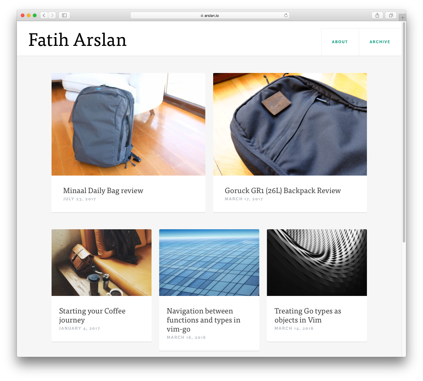
This is how my new home page looks like. I usually add the screenshots of my blogs to see how it evolves in the years of usage. This time I've opted for something more clean and minimalist (more on this later here!). I've started to travel more minimal and over the past year made many choices to be better at this. The design reflects some of it as well.