How I Designed a Dieter Rams inspired iPhone Dock
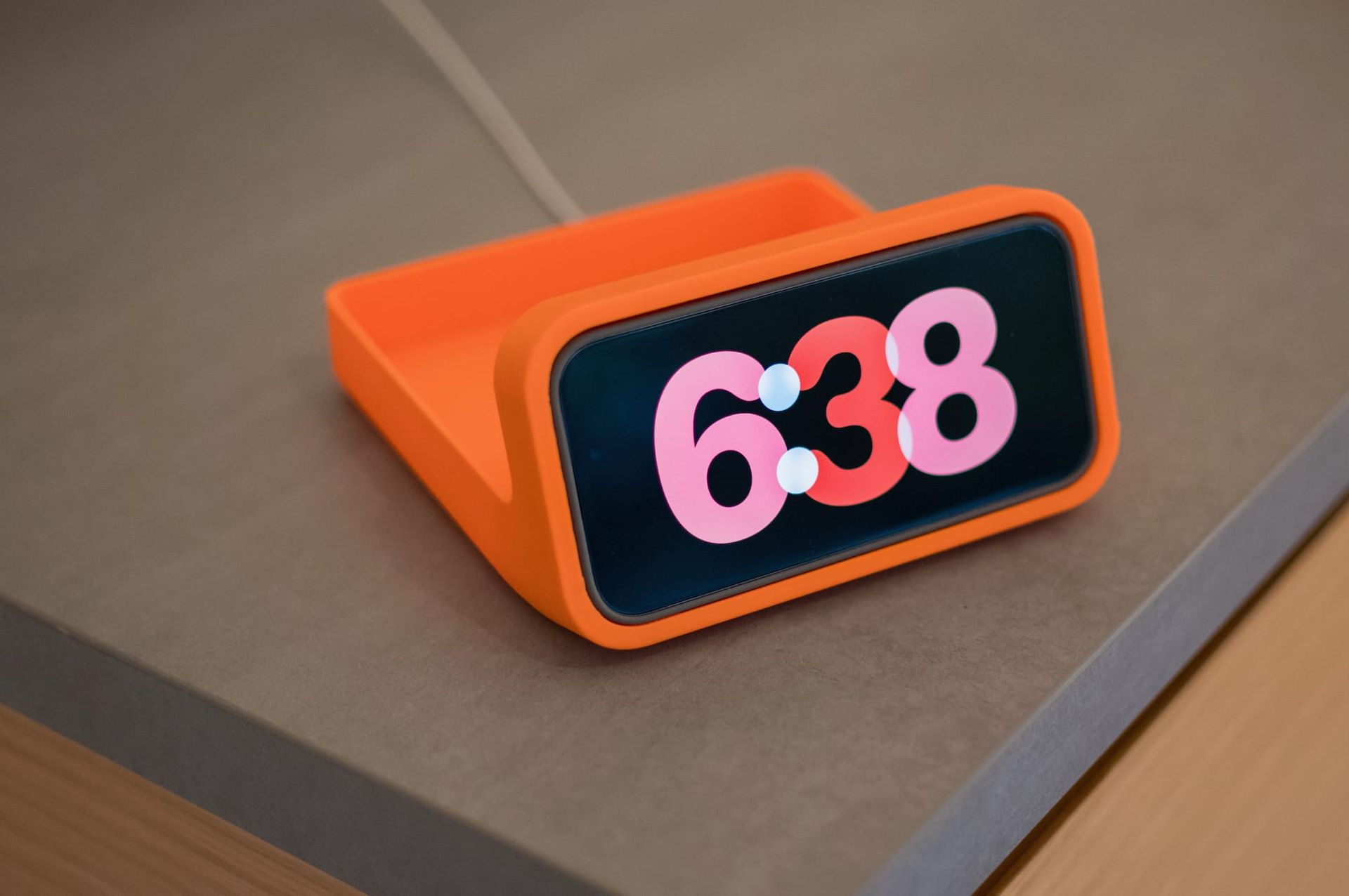
Dieter Rams and his friends (Dietrich Lubs and Ludwig Littman) designed many great looking alarm clocks. I'm looking for one for a long time. Because I have many books about Braun (the company) and Dieter Rams, here are some of their designs:
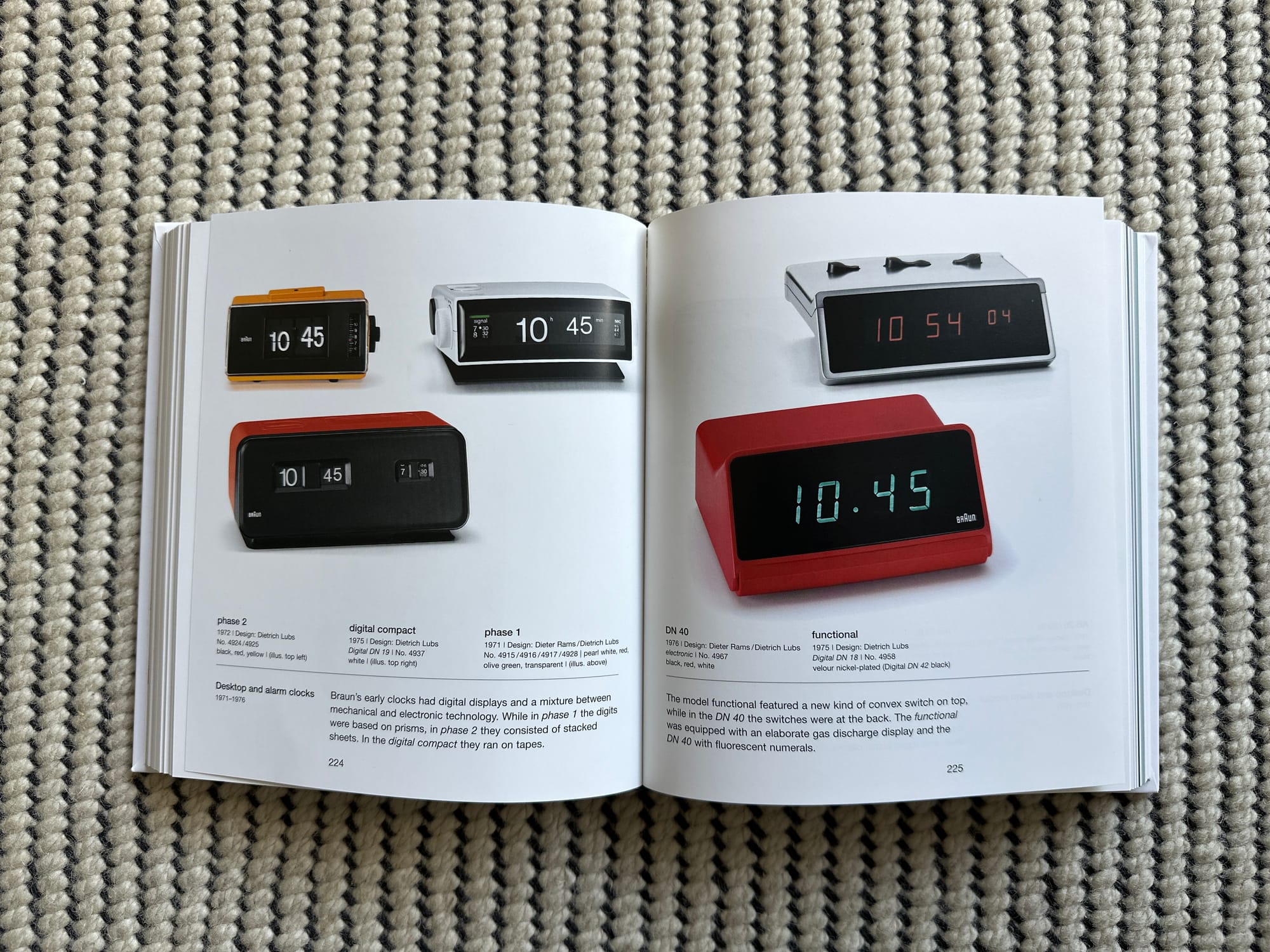
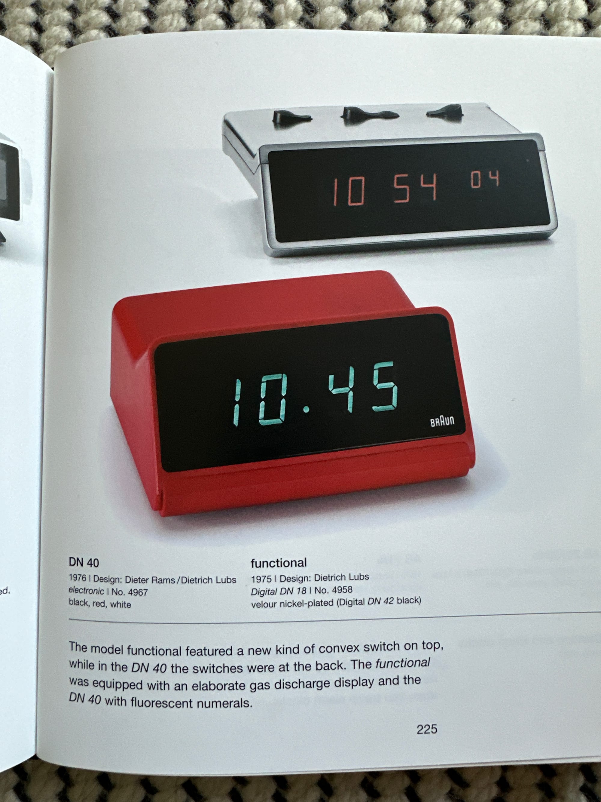
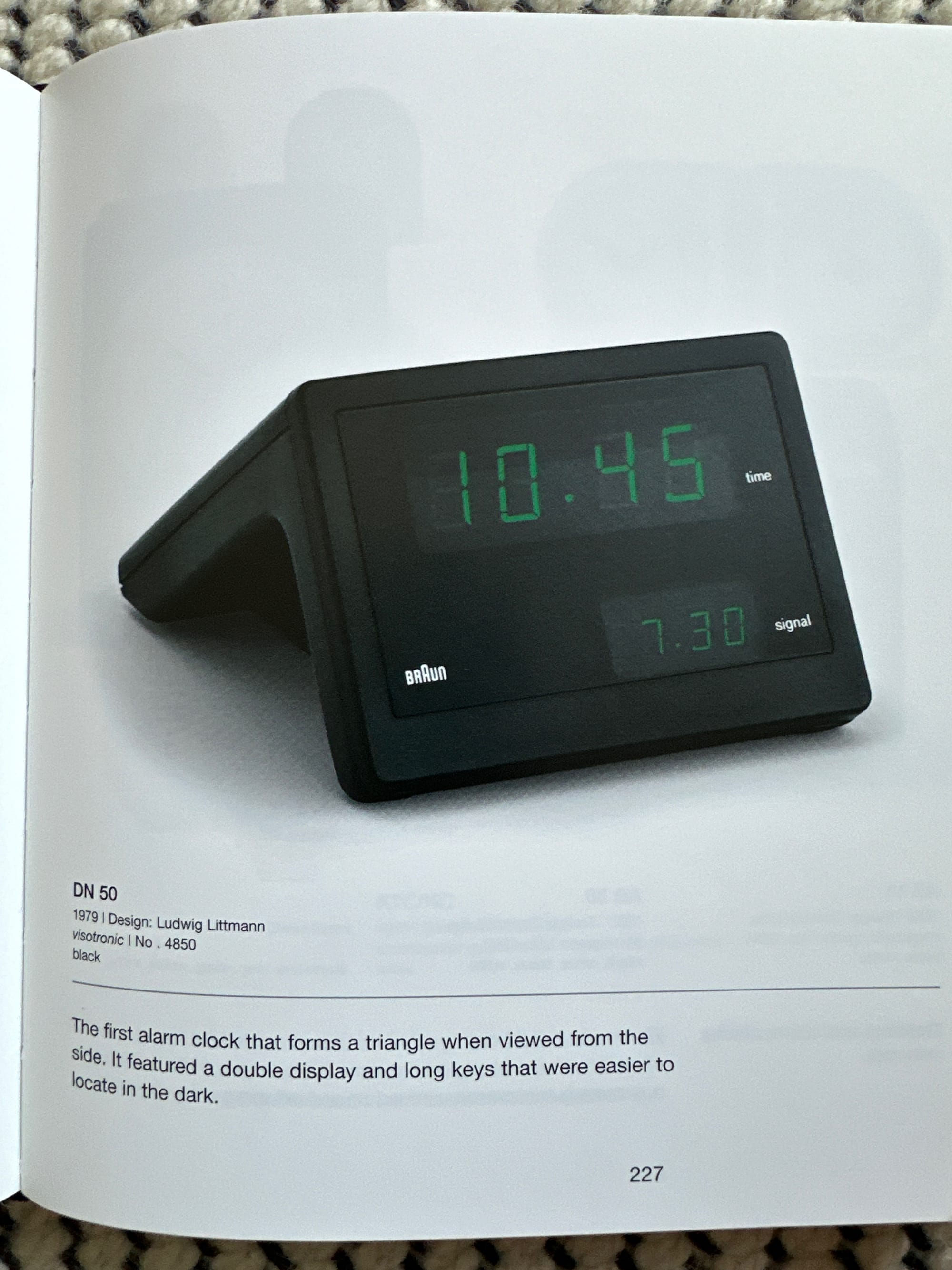
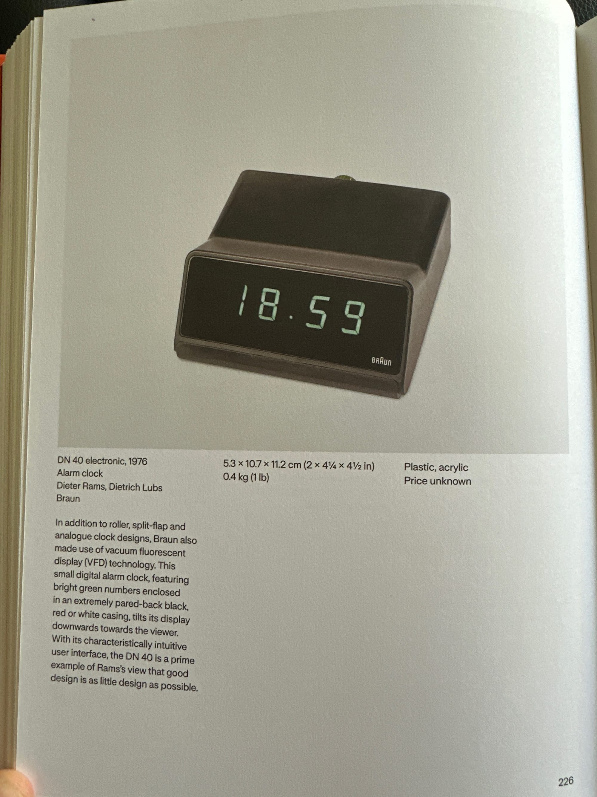
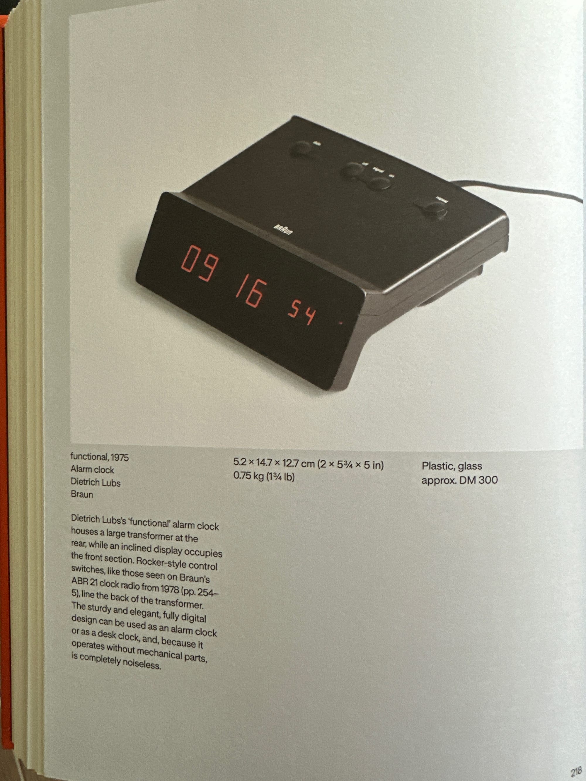
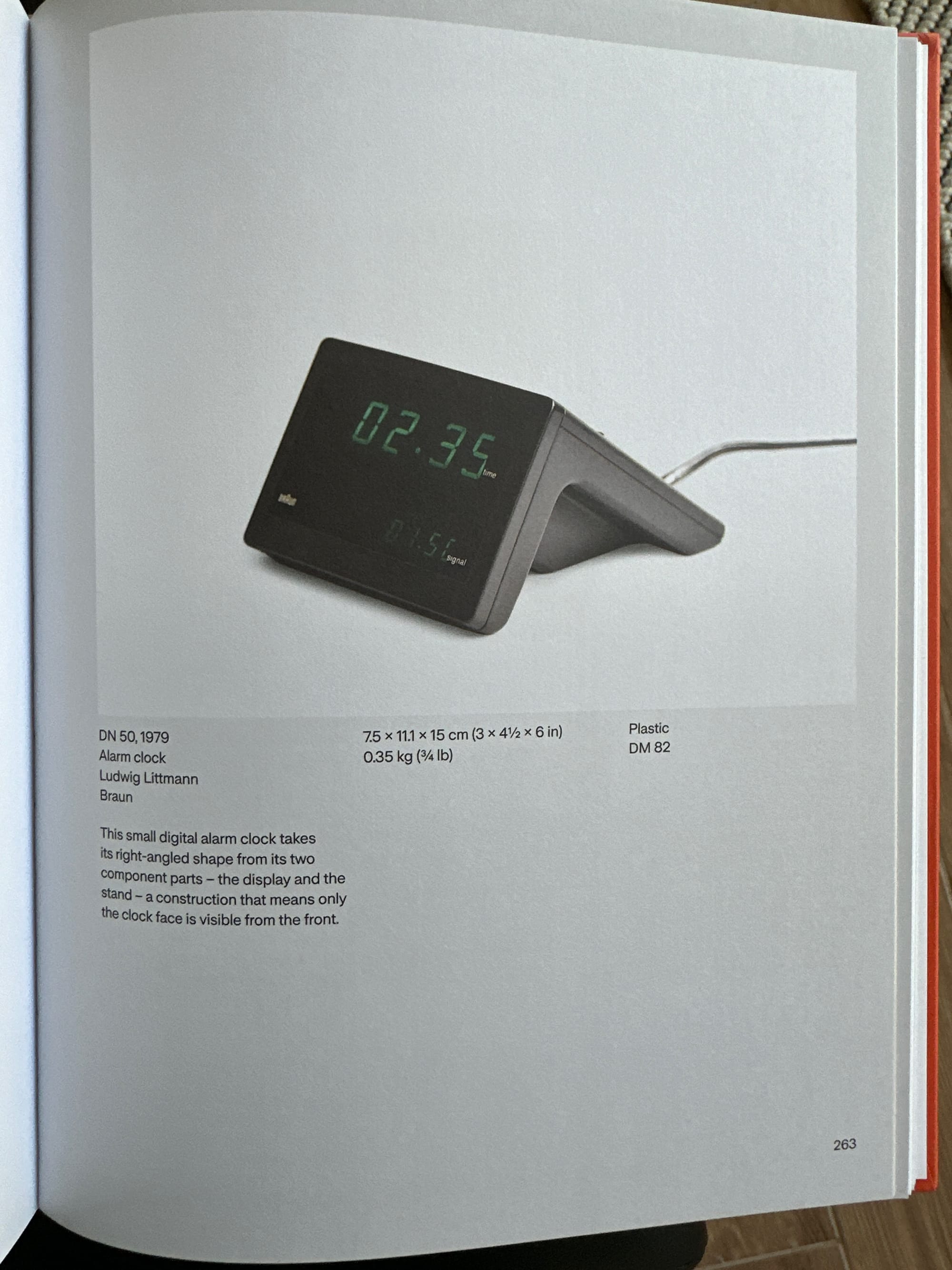
The various vintage desk and alarm clocks by Braun
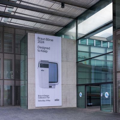
I have been looking for an original DN 40 for a long time. As many of you know, I also visited the annual Braun Collector's Fair to source this alarm clock. It's hard to find one in pristine condition.
However, there is another problem. This is what my current bedside table looks like:
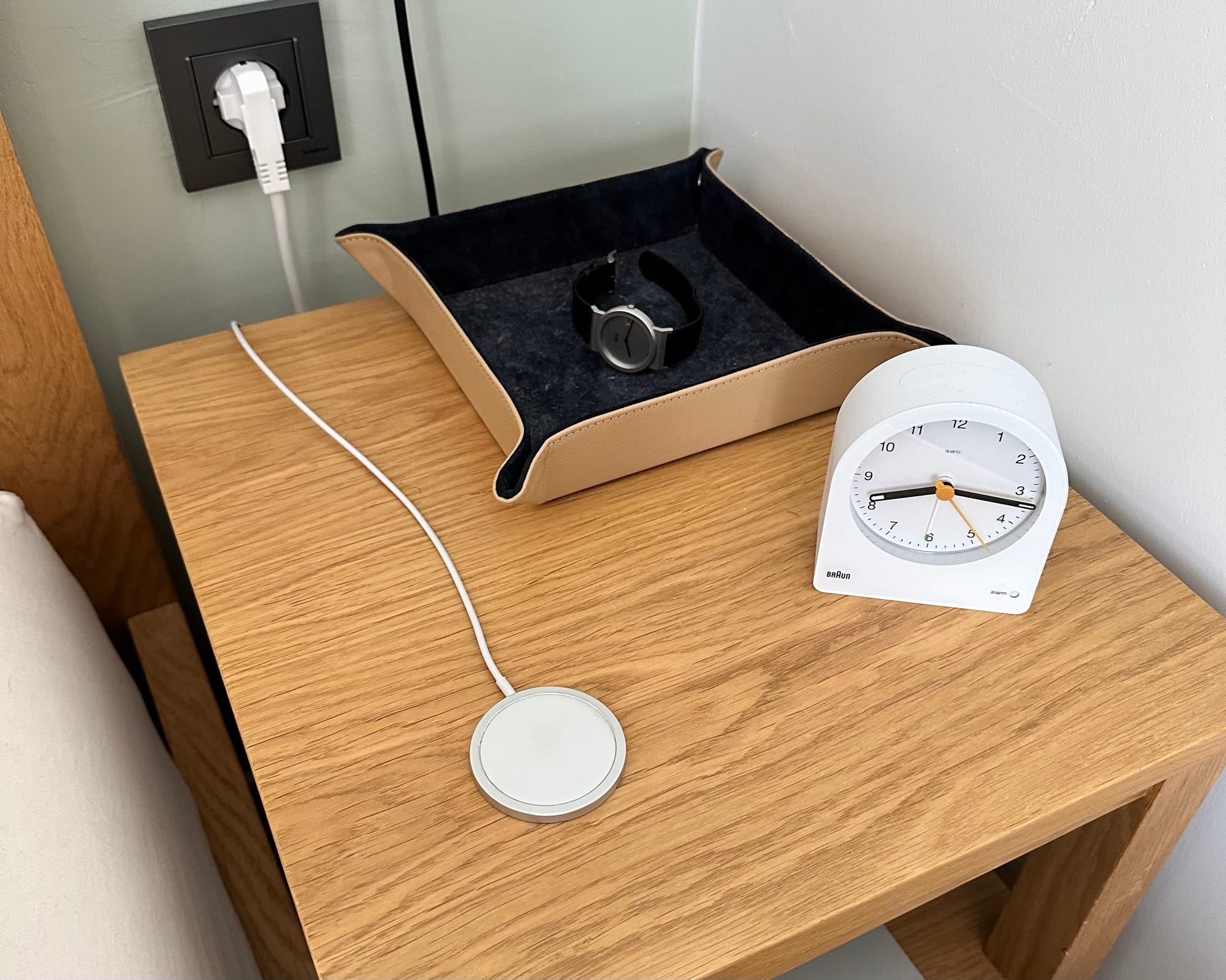
If I put the DN 40 here, the bedside table will be crowded. For one, I like to have a watch that shows me the time when I sleep or wake up. I use the tray to put my hearing aids, watches, pens etc. Otherwise, they might get damaged or fall off. Third, I have an iPhone MagSafe charger. The problems I have with this setup:
- They take up a lot of space
- It's hard to put and take my iPhone
- It's crowded, especially at night, and knowing where the objects are is hard.
So, a few weeks ago, I watched a YouTube video that changed my perspective on iPhone's Standby mode:
What a great video. Anyway, I immediately 3D printed this design:
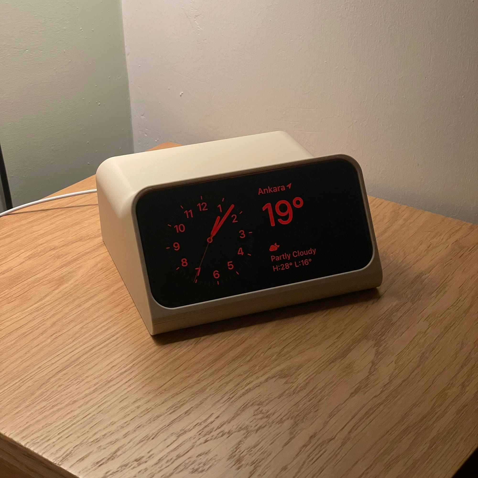
The DN 40 is the Alarm clock Scott and Overwerk were inspired of. However I had a few issues with the inspired design:
- It's too big and still takes up a lot of space. This is no surprise, of course, because the iPhone's screen is big.
- It replaces my charger and desk clock, but I still have to use my tray.
- You need an adhesive for the MagSafe charger.
Over the years, Braun went through many turbulent years , but lately their Design department releases great products. They of course released a newer version of these alarm clocks, the BC21:
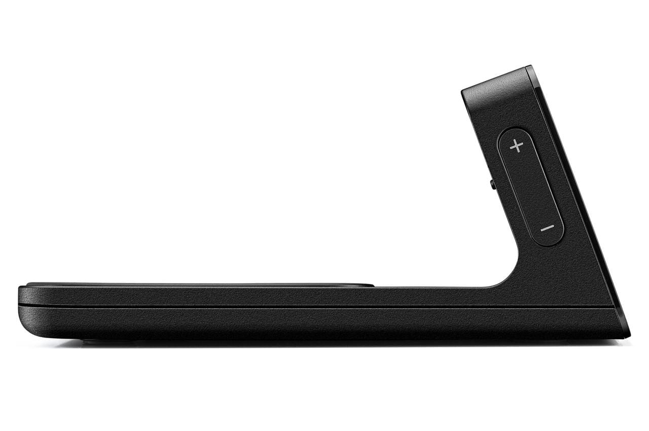
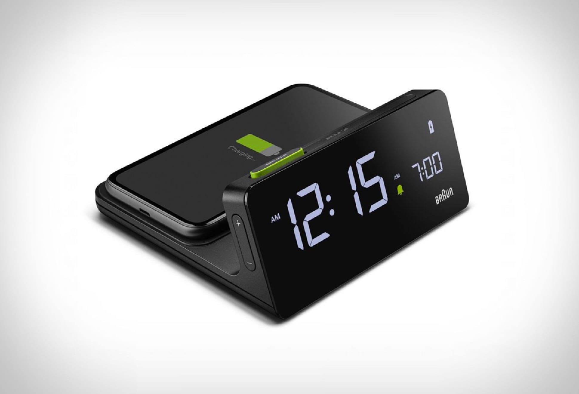
The form of the BC21 is reminiscent of a classic Braun product while its function has been redefined for a modern user.
The new design reflects the current modern era better in my opinion. It's slick, slimmer and has a multi-purpose form. It's not only a wireless charging pad for your phone, but also an alarm clock.
I had a muse at that moment, and finally came up with an idea to solve some of my issues. I decided to combine all my objects (tray + charger + clock) into a single one.
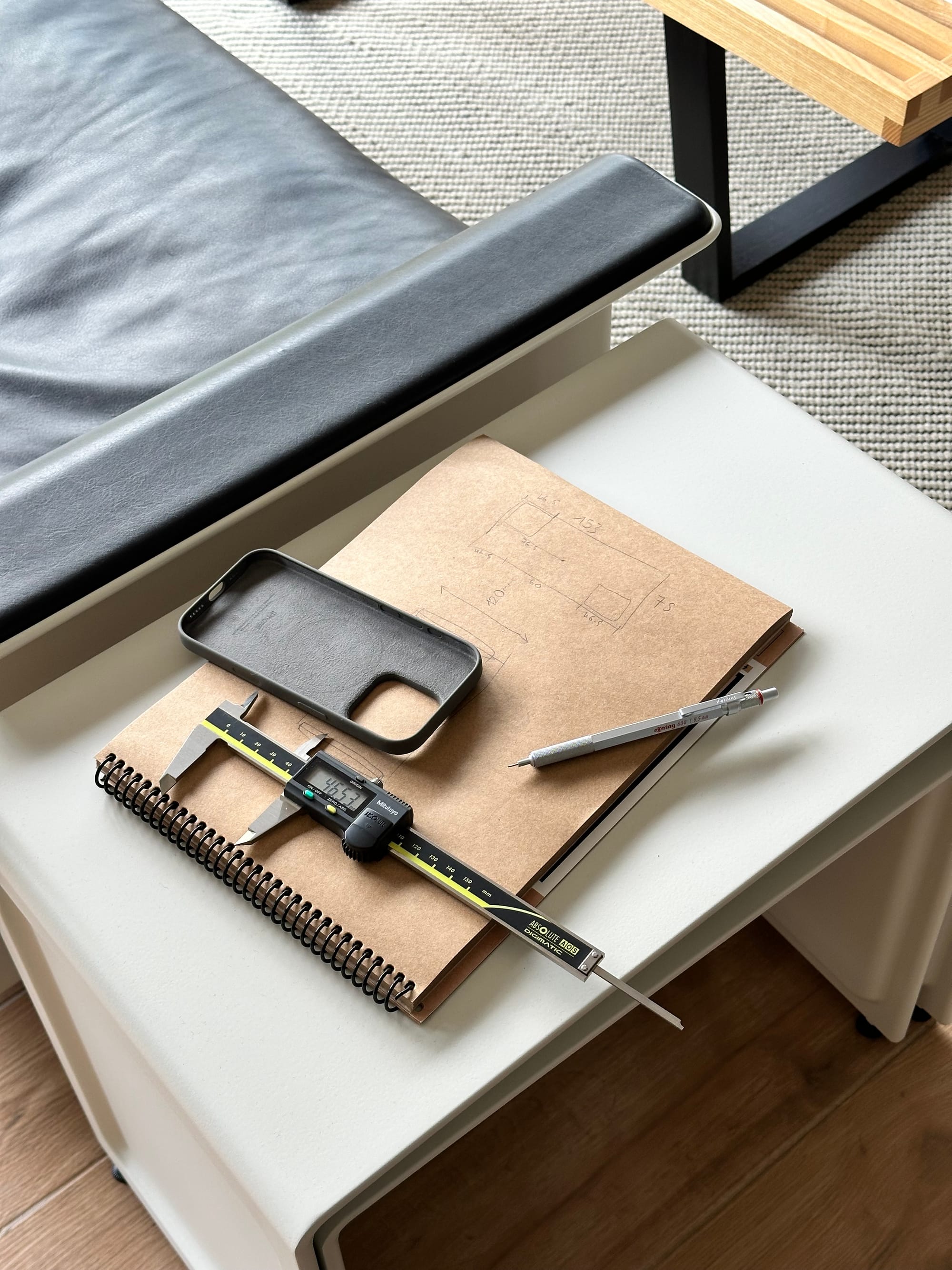
So I started taking notes and created the first, basic prototype:
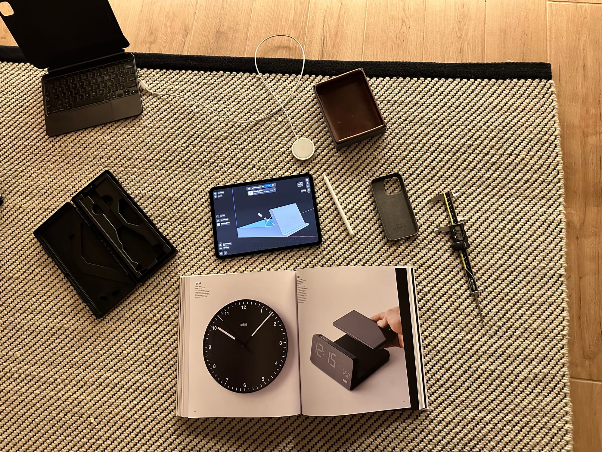
I also had a leather valet tray lying around, and I thought I could use that as an insert so when I put my watch, it's protected by the rough 3d texture:
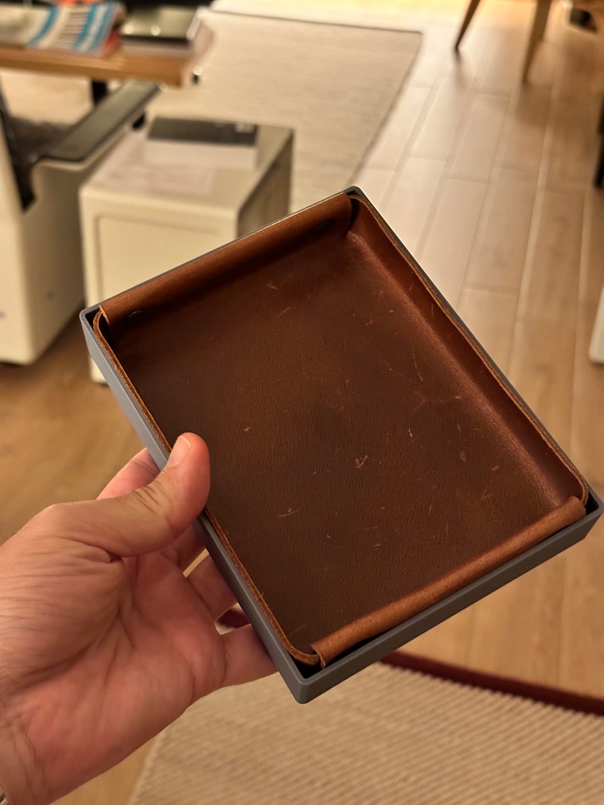
After a few hours of design + a few hours of printing I had my first initial prototype
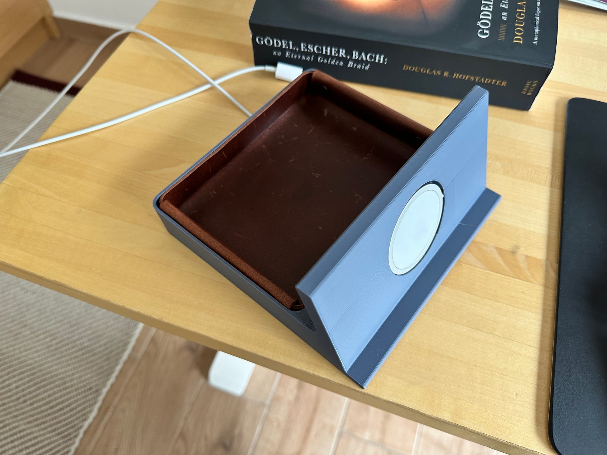
I nailed the valet part, but the MagSafe part didn't look nice. So I started iterating, and had many versions of the same design, each time with a more refined shape. Here is another one (I abandoned it later):
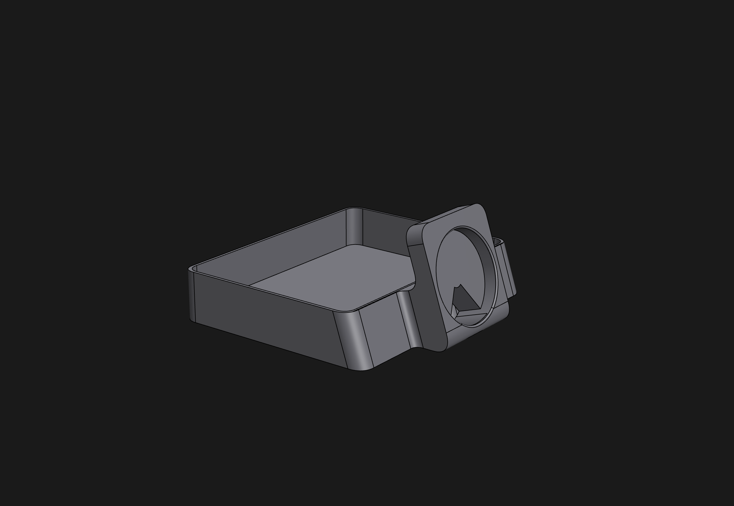
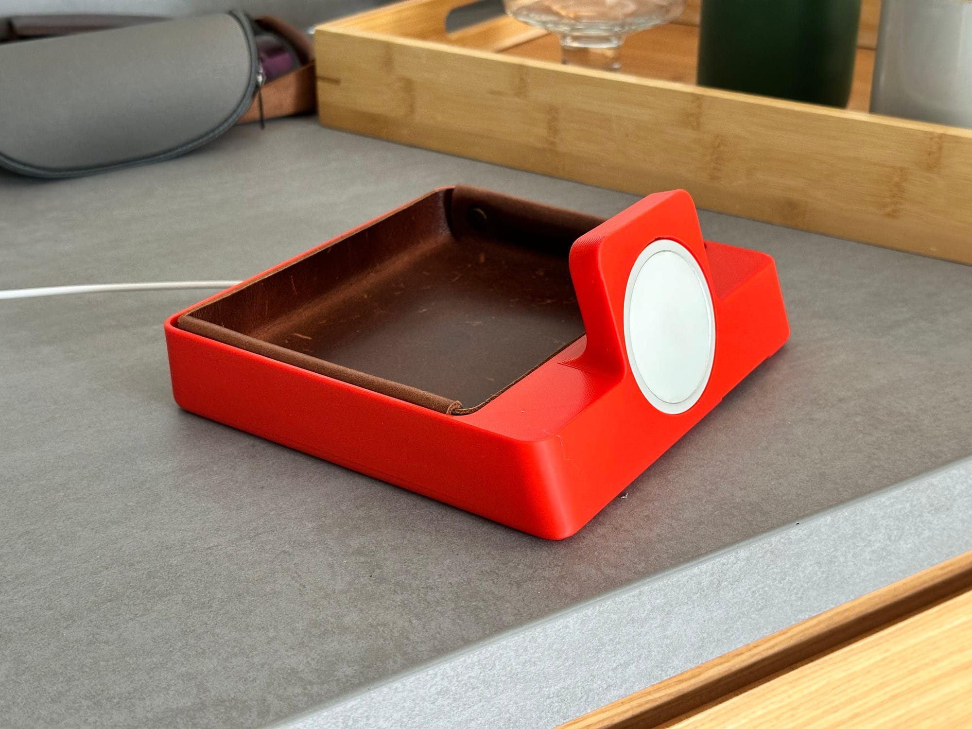
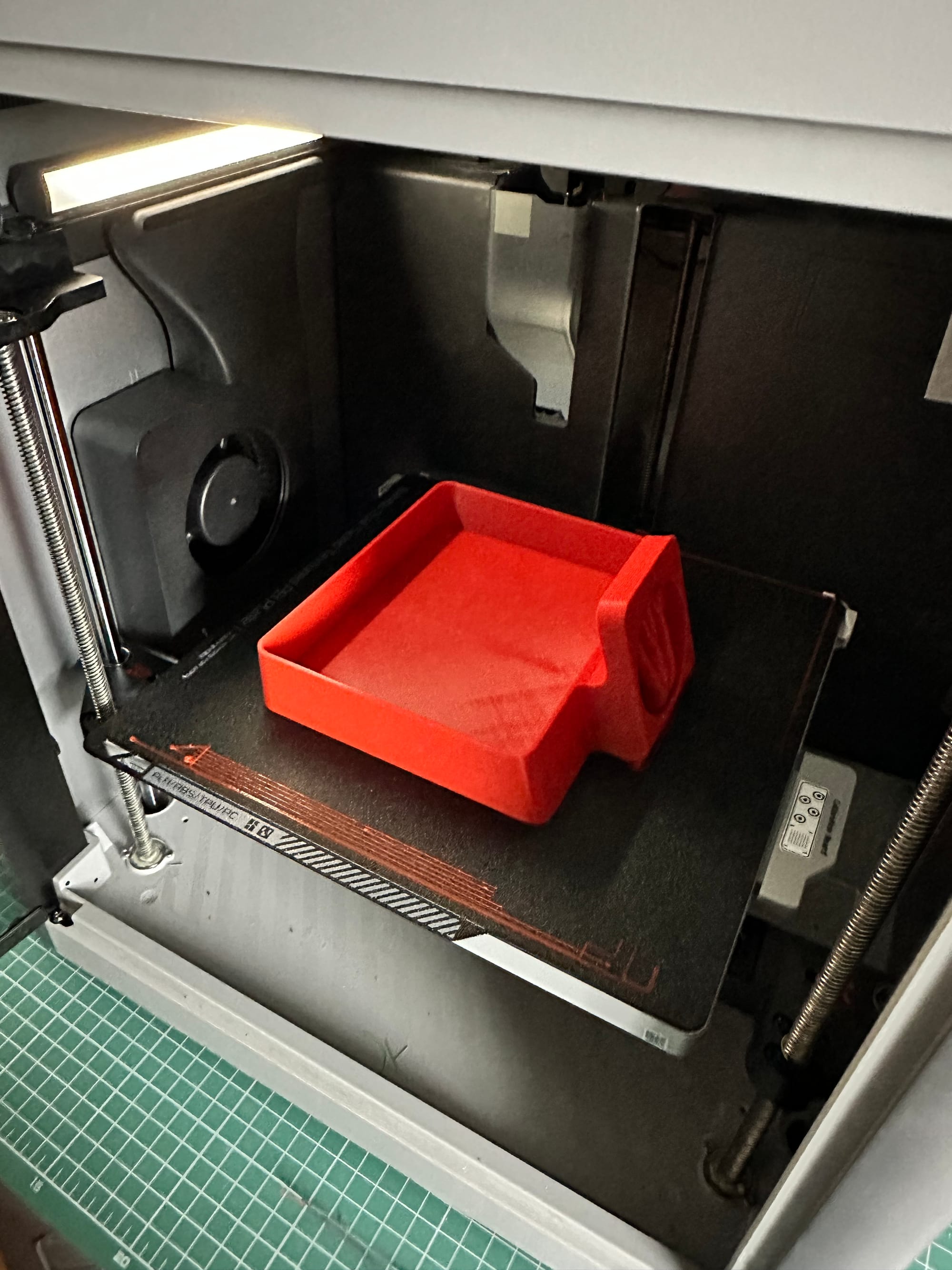
One of my failed designs. The MagSafe's proportion wasn't as nicely to the rest of the body.
There were many small details I had to figure, for example the iPhone doesn't use a circle for their corner radiuses:
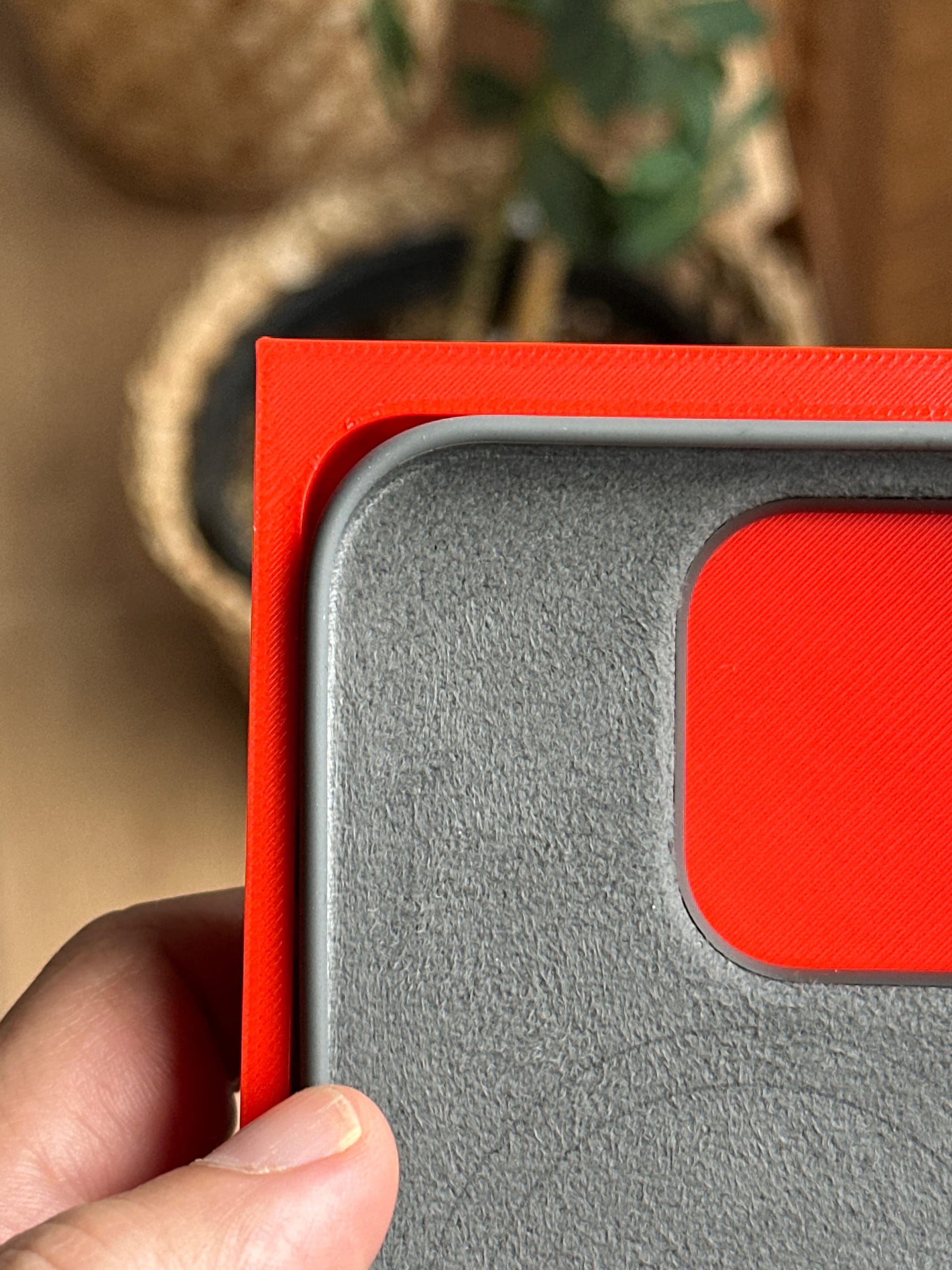
Instead the iPhone has multiple G points and curvatures:
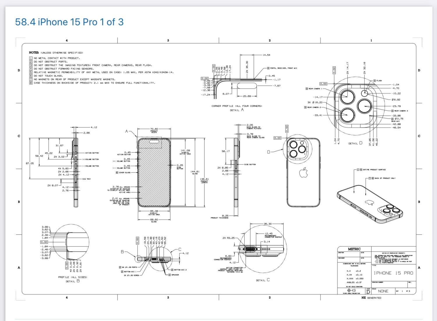
After fixing it, I played around with a case that would wrap the phone:
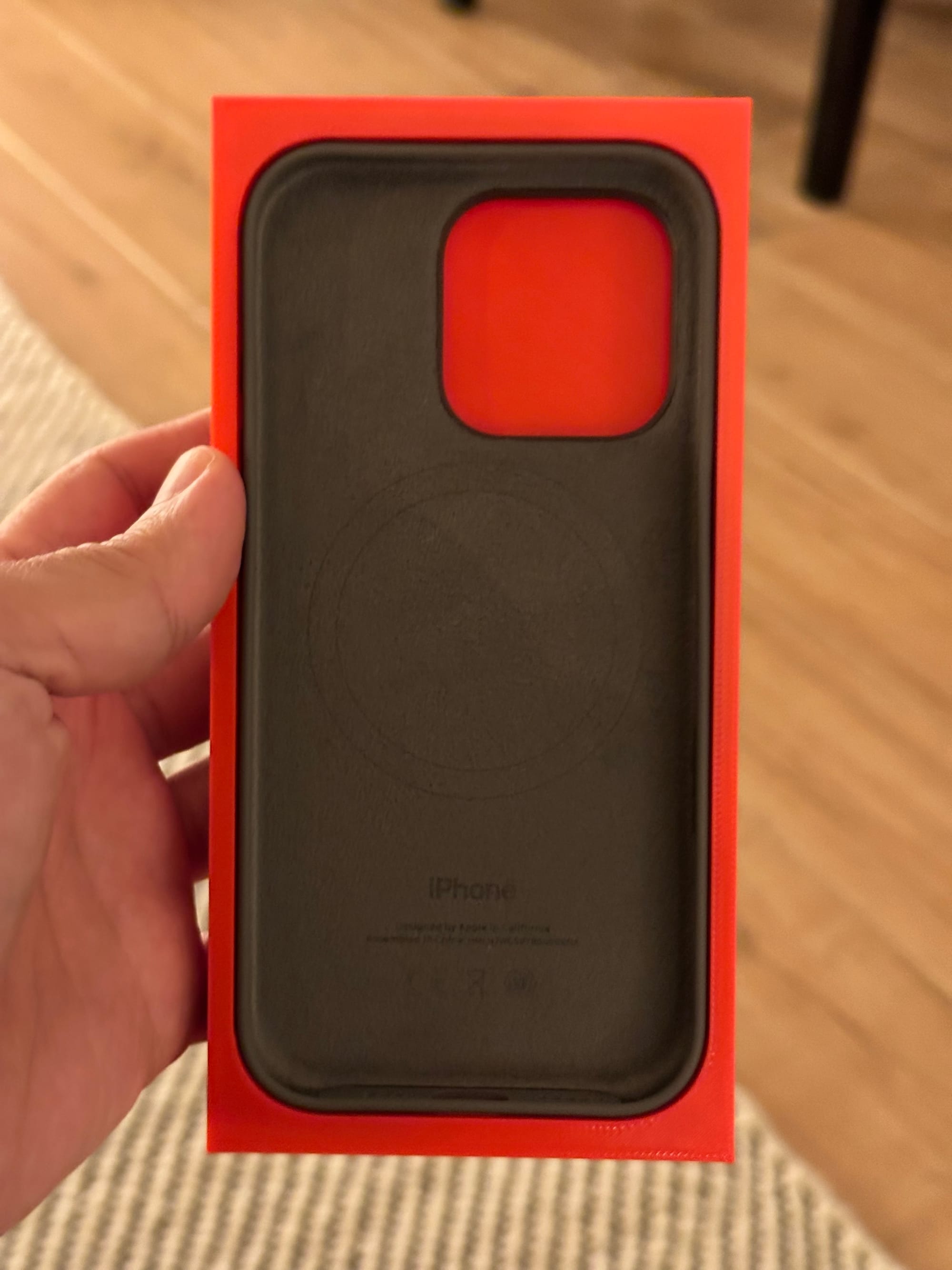
Here is a version I came up with, which I used for my future iterations:
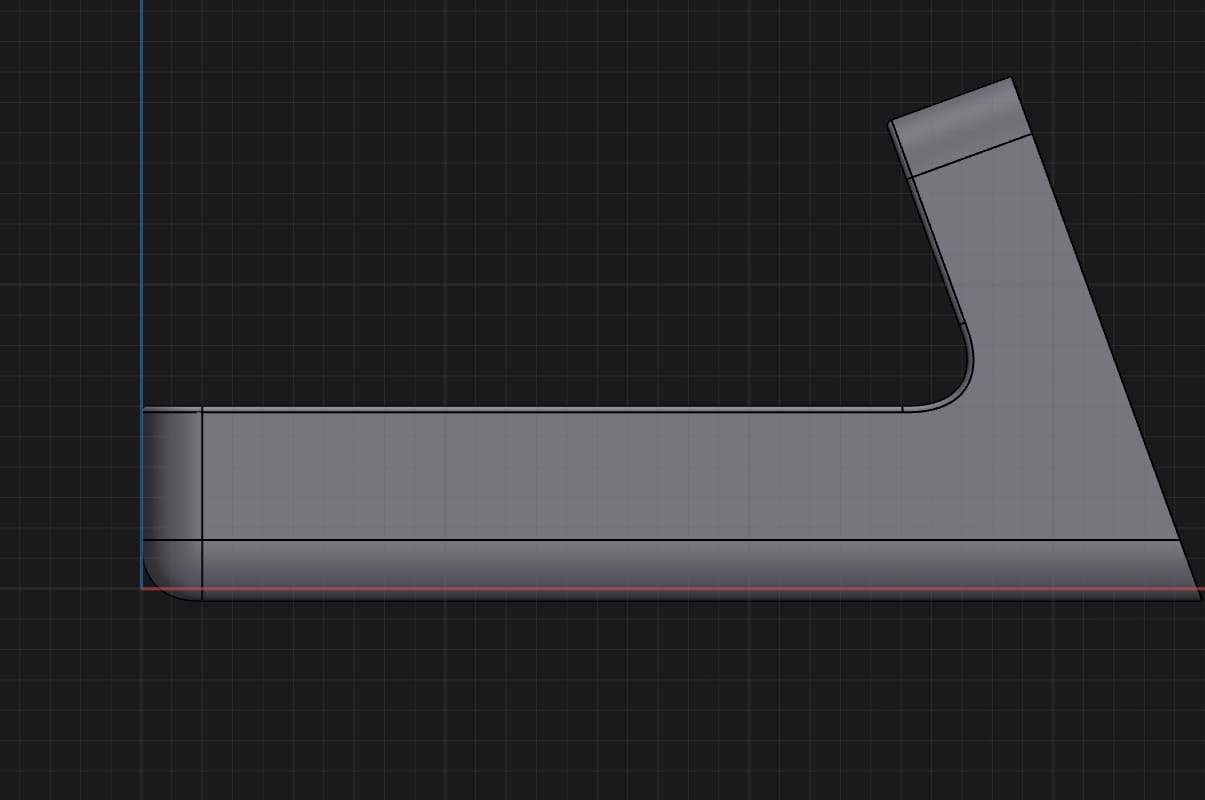
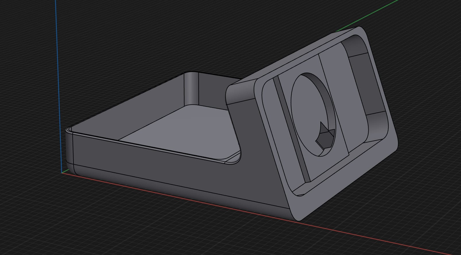
This design was not only looking better, also was heavily inspired by the BC21 (which was inspired by the DN 40). I printed a version of this and shared it on the internet:
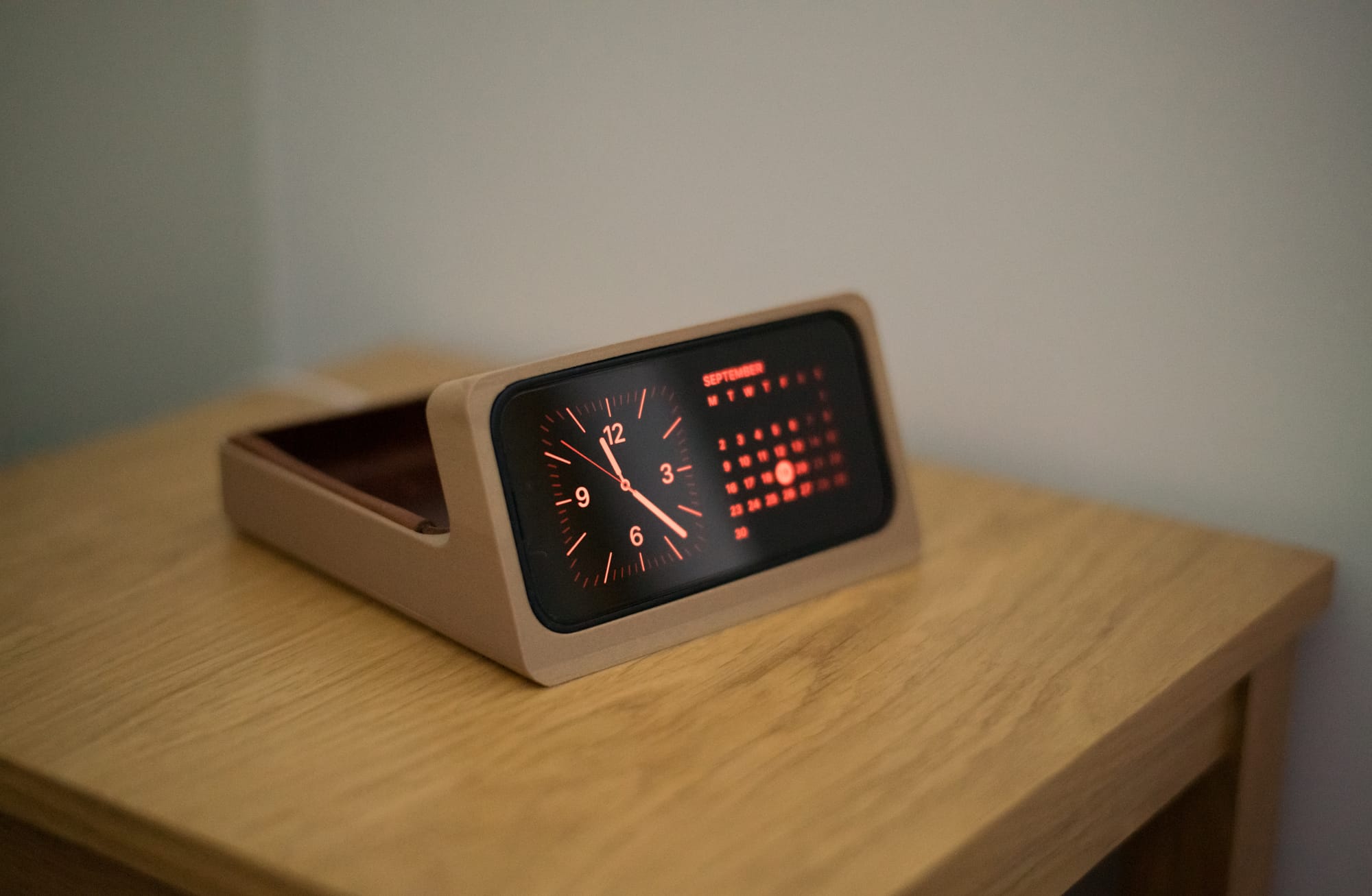
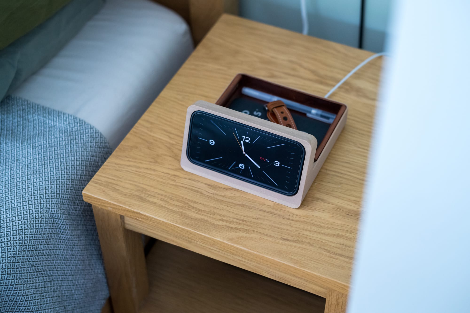
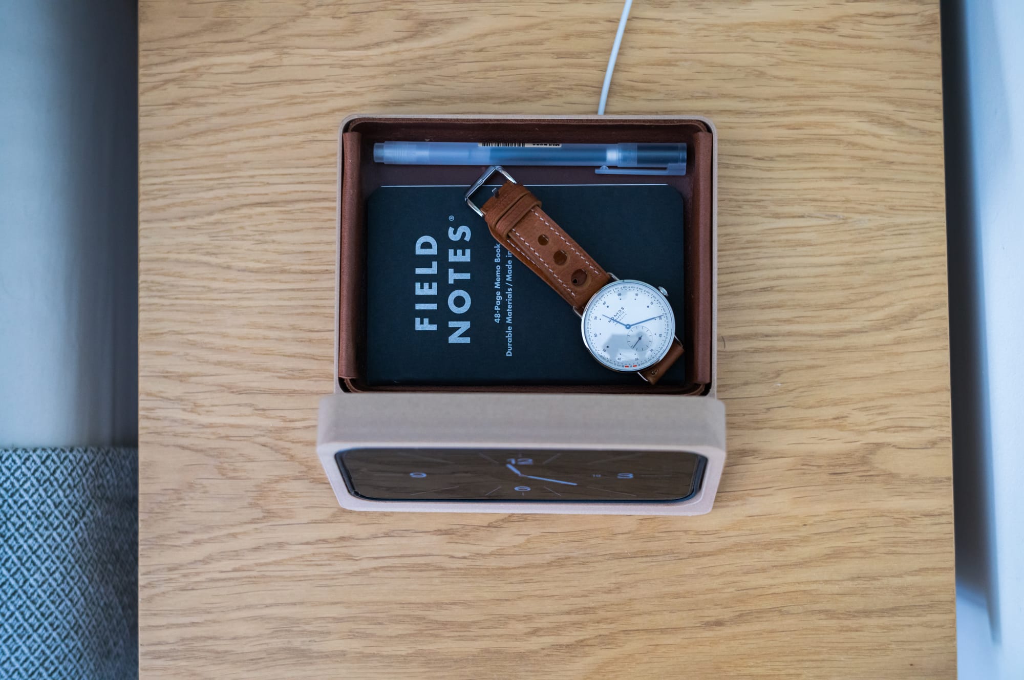
Some photos how the tray is being used:
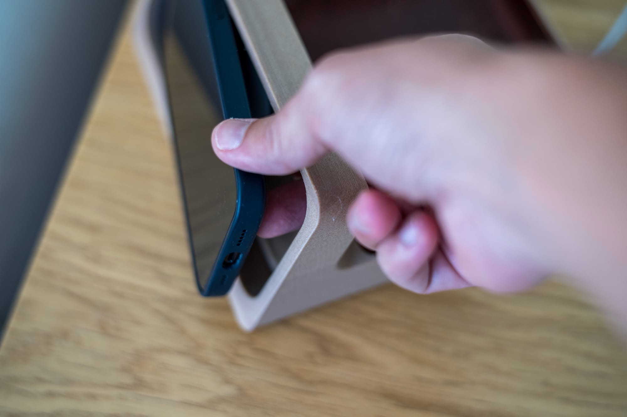
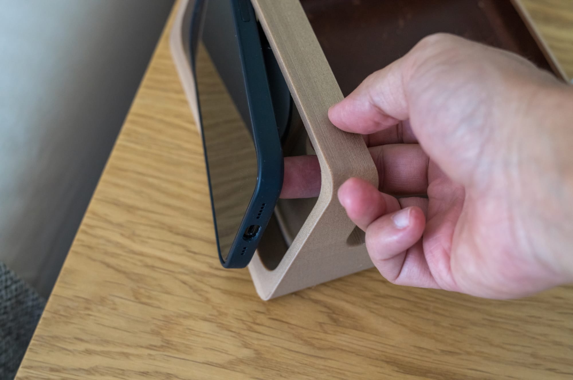
And here is how you take out your phone from the dock:
Of course, no design is finished. At least there are still things one can improve here. And I wasn't quite yet happy with it.
I went back to my CAD app and started working on it. During the iterations, I shared my designs with a few friends and asked them what they thought about them as well (thank you, Adem).
After a few tweaks, I came up with a design that was more rounded. I also printed with a more colorful color, as an ode to Braun 550 Hair Dryer and Jaro Gielen's "Soft Electronics" book.

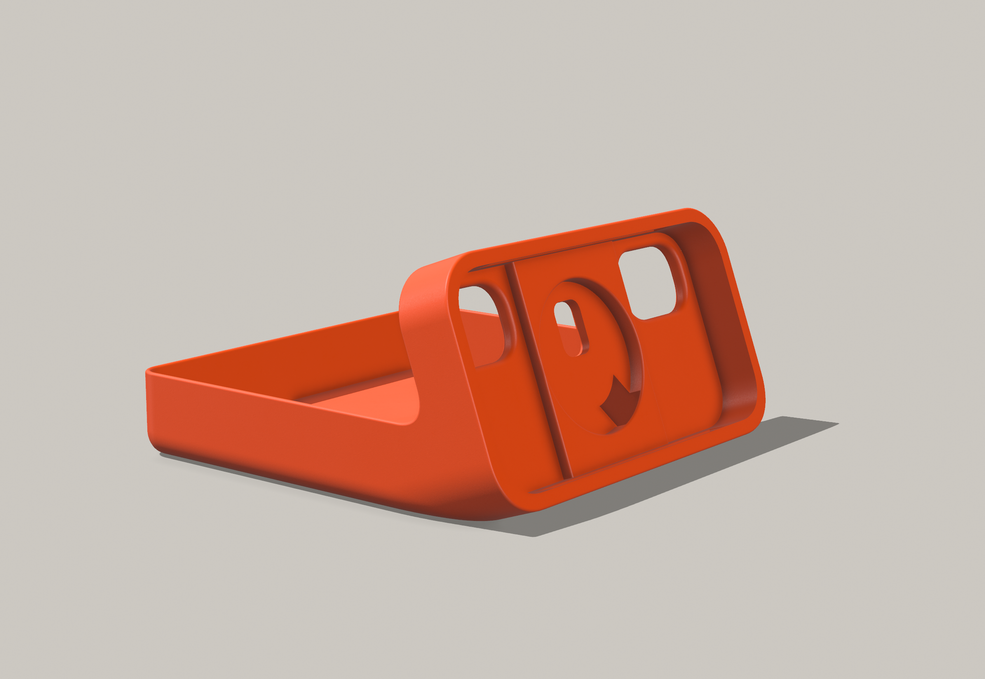
I further improved the Standby Dock with more rounded corners.
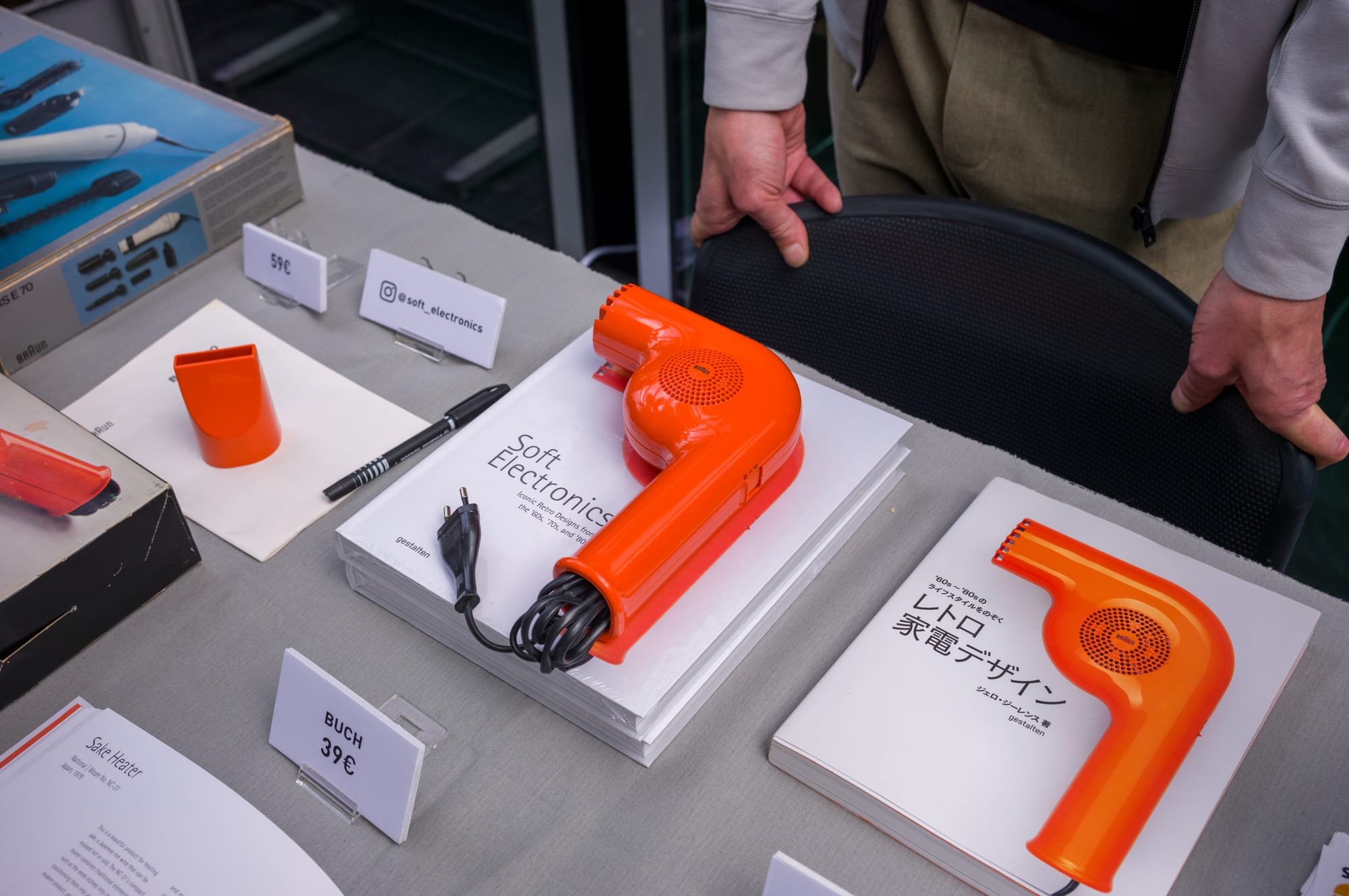
This particular design stuck with me. Initially I was skeptical about it, but the more I looked at it, the more I loved.
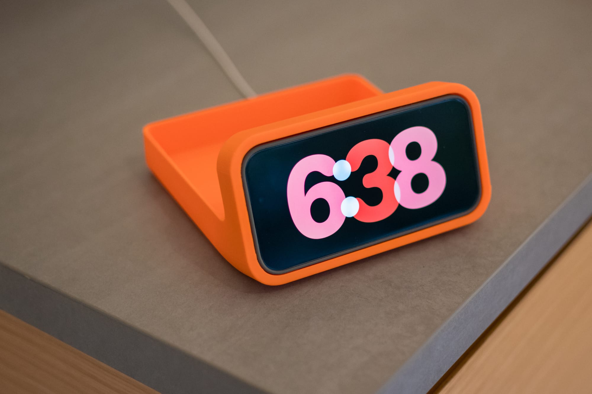
Of course because I 3D Printed it with a PLA filamanet, it's not as shiny and glossy compared to actuall electronic devices. People use acetone and various solutions to make it shiny.
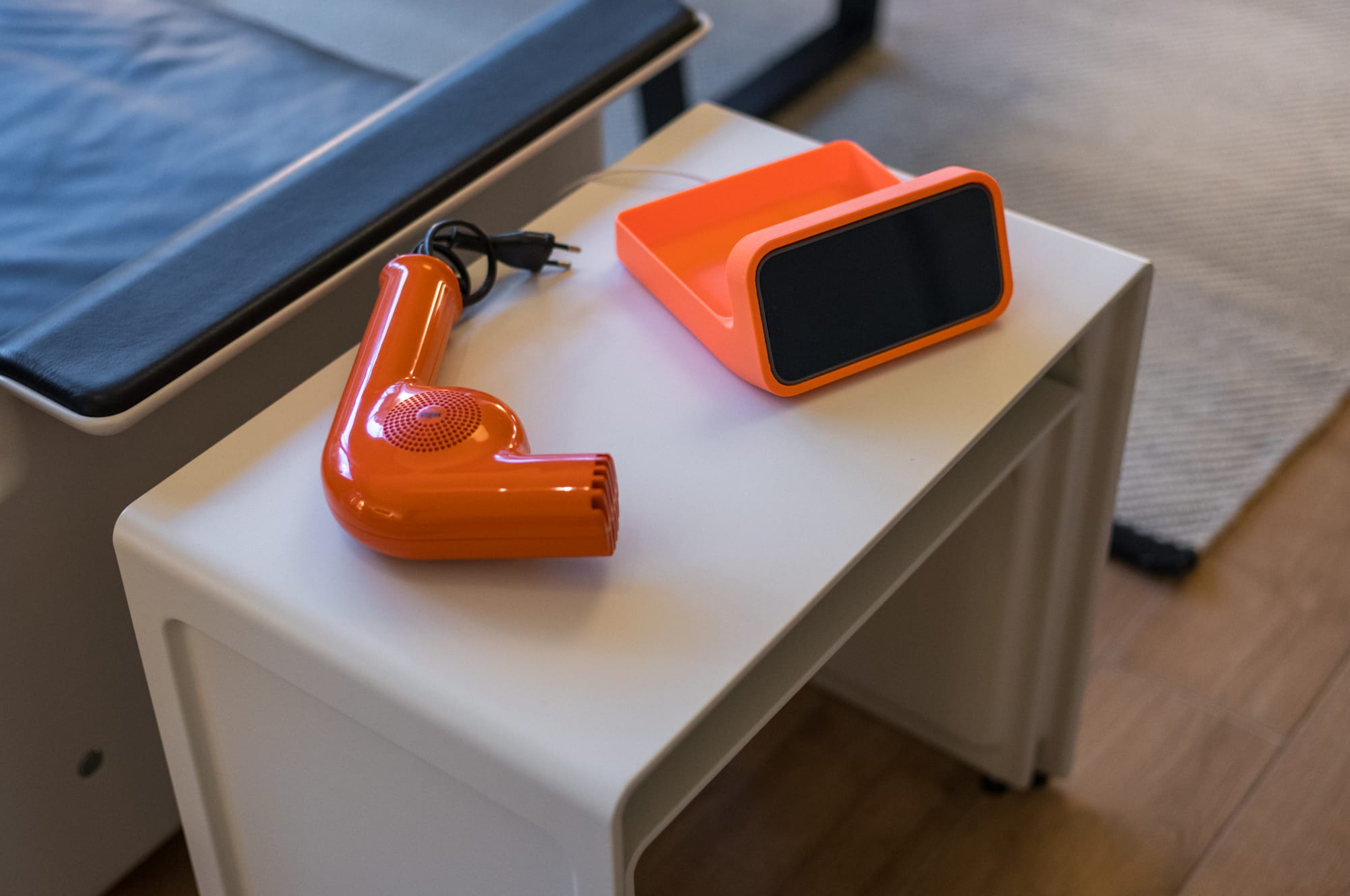
What I like about this version is how more comfortable is to hold this. It has no sharp edges anywhere
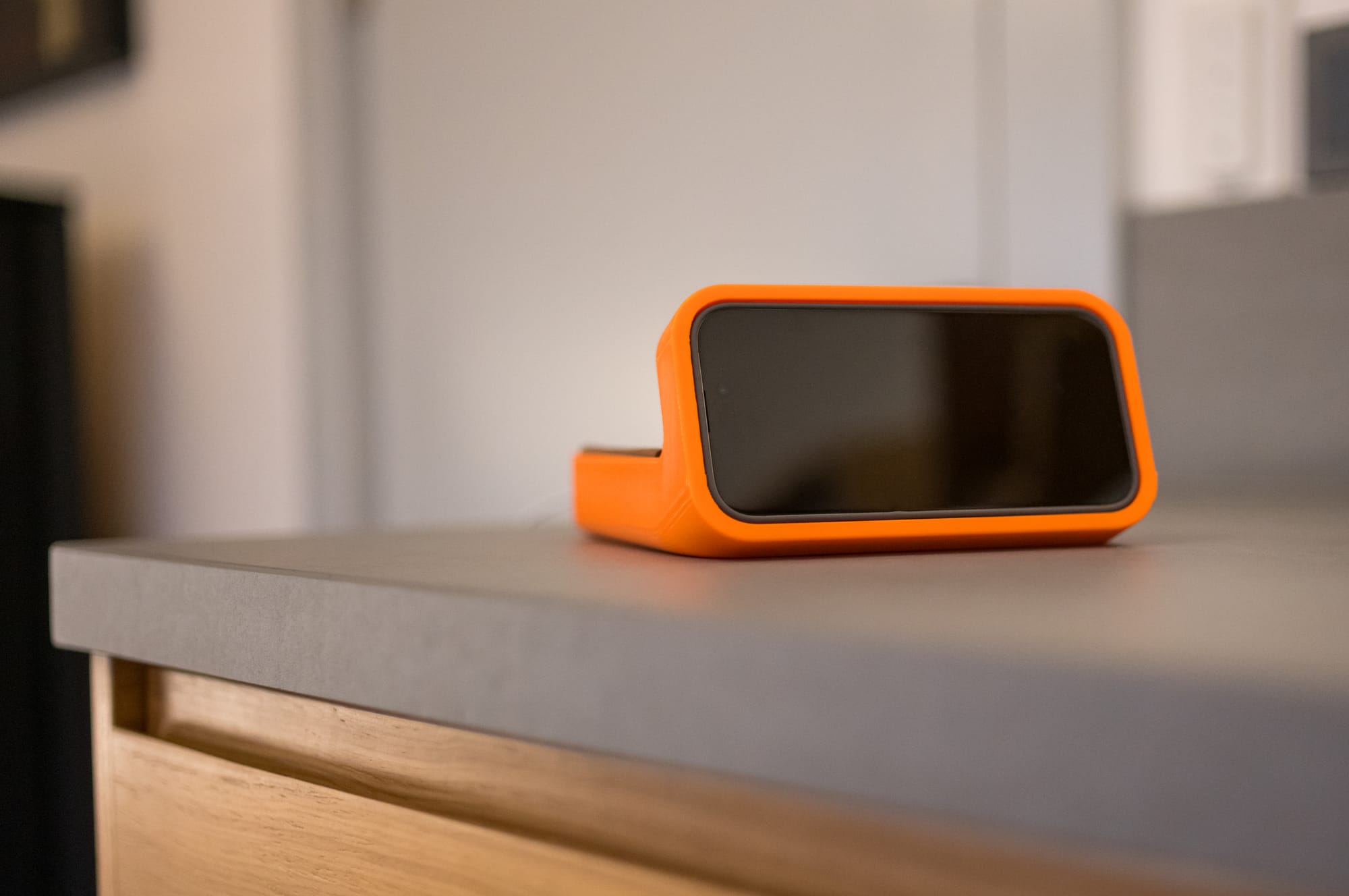
Now the base design was finalized, I made a few more changes. The sharp edges at the front are removed, the tray insert is also less sharp.
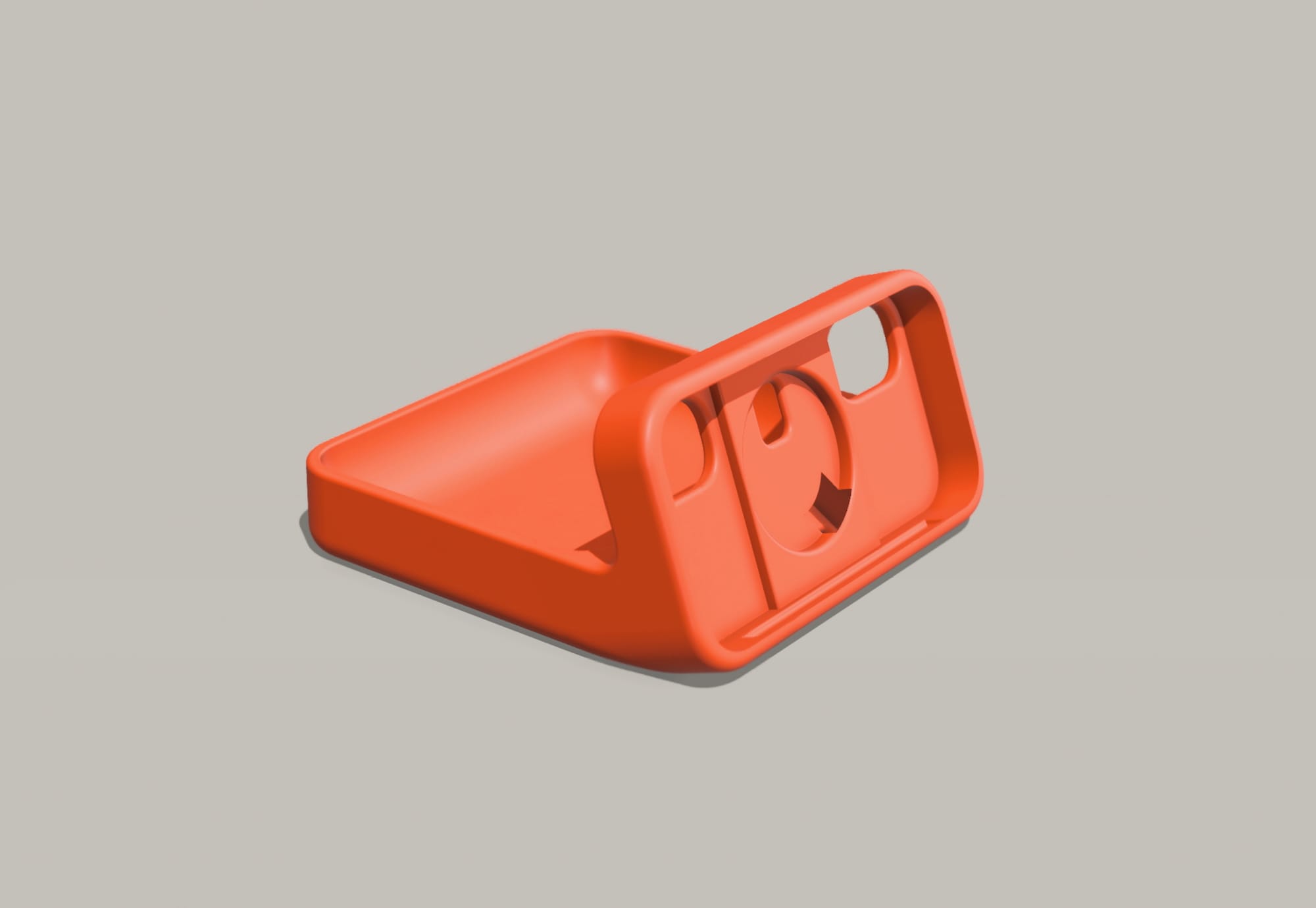
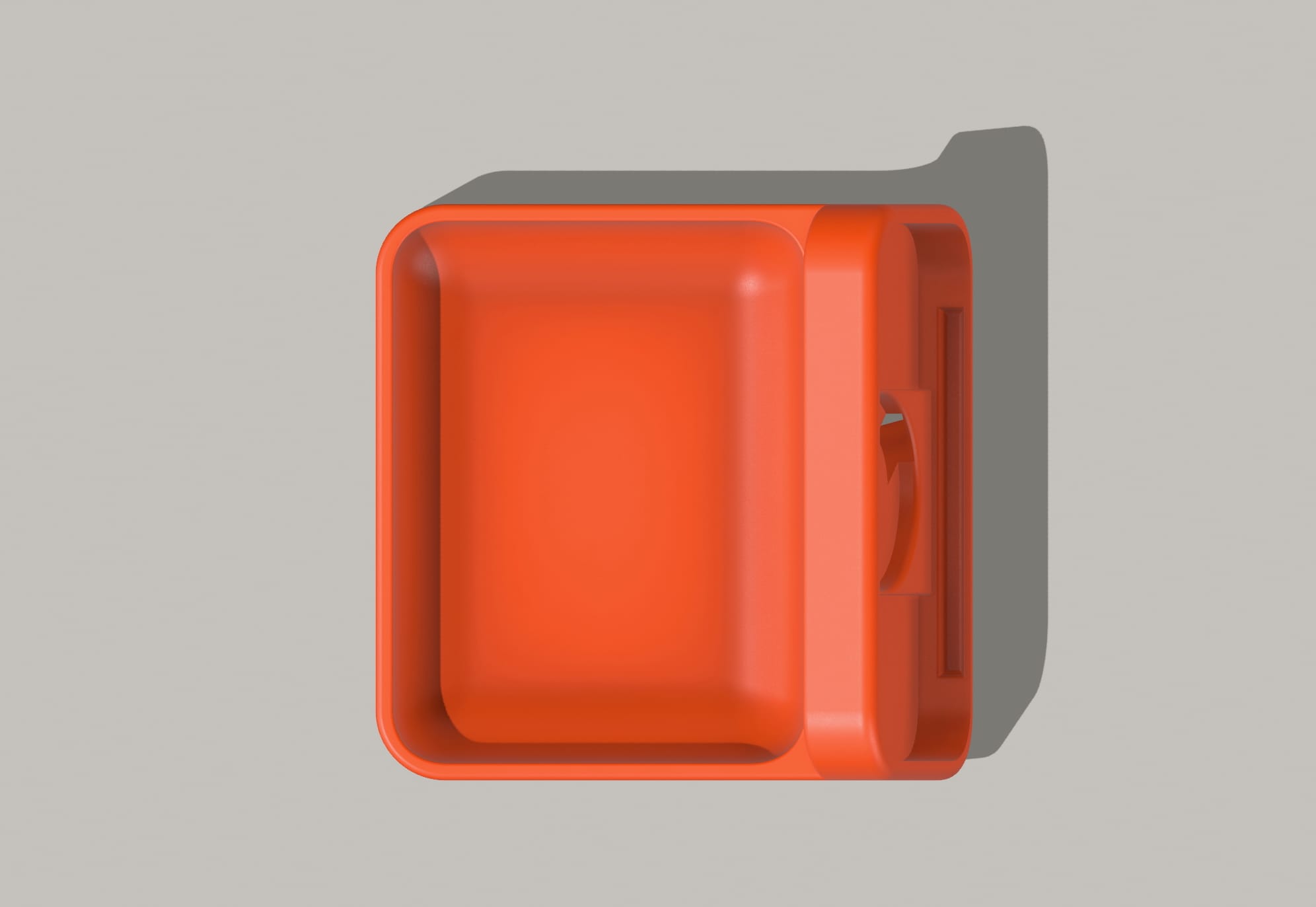
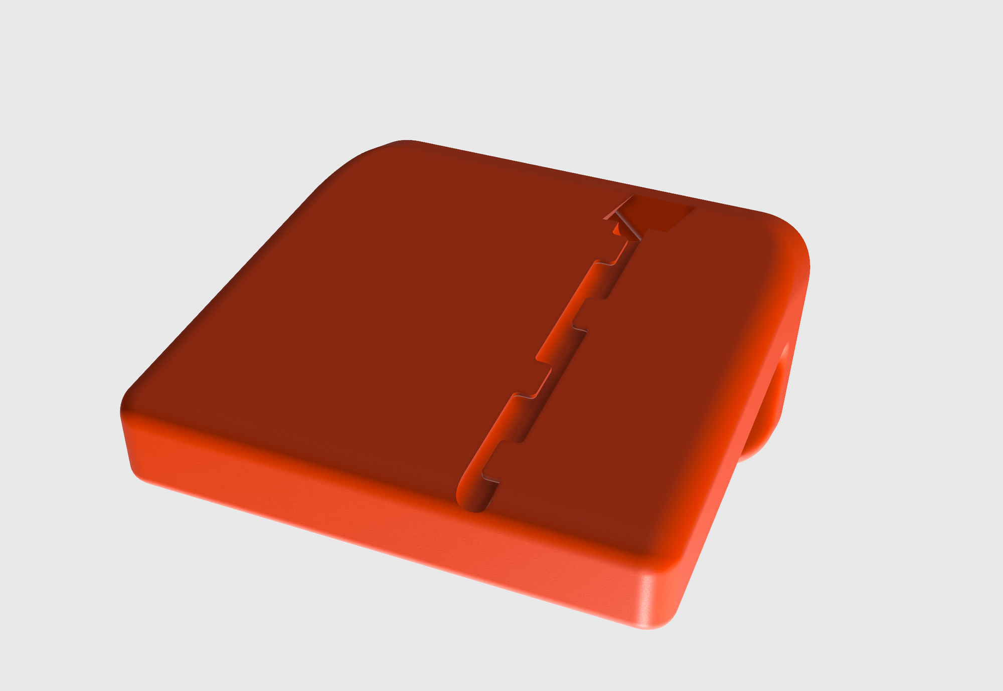
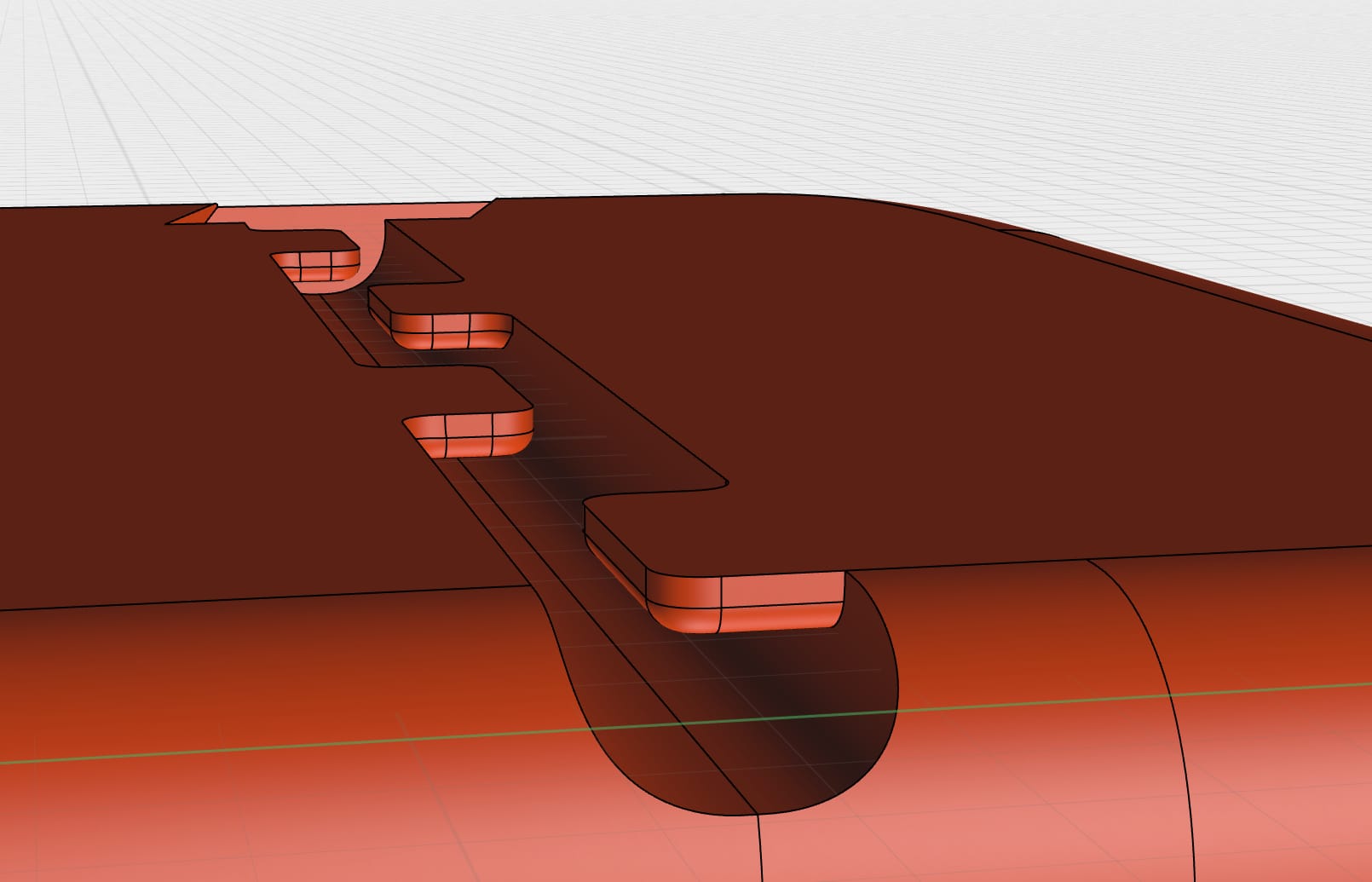
However the most obvious addition was the cable canal optimization. After putting the Magsafe, the cable would juggle around, and I wouldn't say I liked that. Because of 3D printing, and because the cable has to be inserted after the print, I came up with this solution:
I'm still astonished by what you can do with CAD software and a 3D printer at home. Even though I'm a software engineer, it allows me to experiment with other arts and skills in my spare time.
I made the 3D model for free under the Standard Digital File License. However, many people like to pay for it, so I created a Gumroad page so people who can afford it can make a small contribution.
Here is the Gumroad page:

Vintage inspired iPhone Standby Dock
Made for iPhone 16 Pro, compatible with iPhone 14 Pro, 15 Pro
